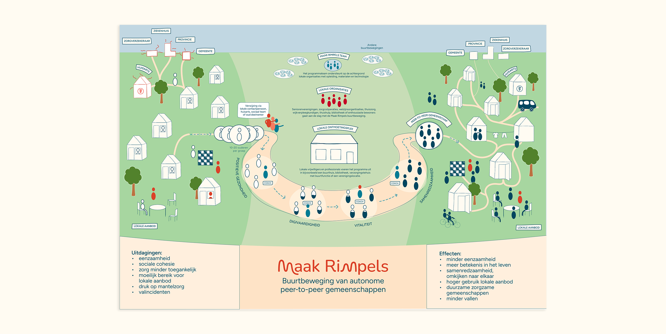
Maak Rimpels brings people from the same neighbourhood together to build stronger social connections and support each other’s mental and physical wellbeing. The need for this is clear. Many elderly people are looking for connection. Yet the initiative struggled to reach them.
listening first
To understand why, we spoke with elderly people from the target group. Although the concept itself resonated, the way it was presented did not. The language felt distant. The visual identity felt cold. And the initiative didn’t feel like something meant for them.
Making it feel close
Rather than changing the concept, the focus shifted to how it is communicated.By rethinking tone, language, and visual expression, the initiative becomes more recognisable and relatable.The identity moves away from something institutional, .towards something warmer, more human, and closer to everyday life.
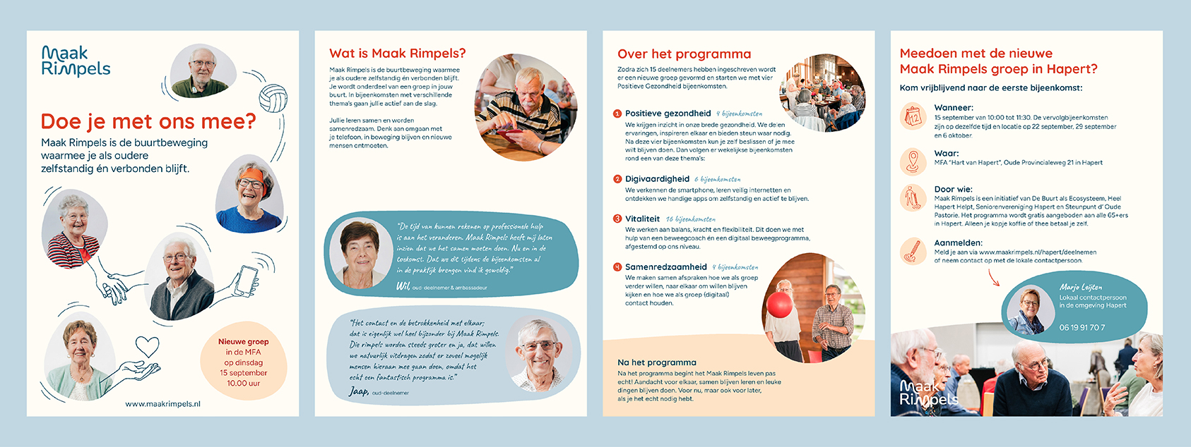
Awarmer identity
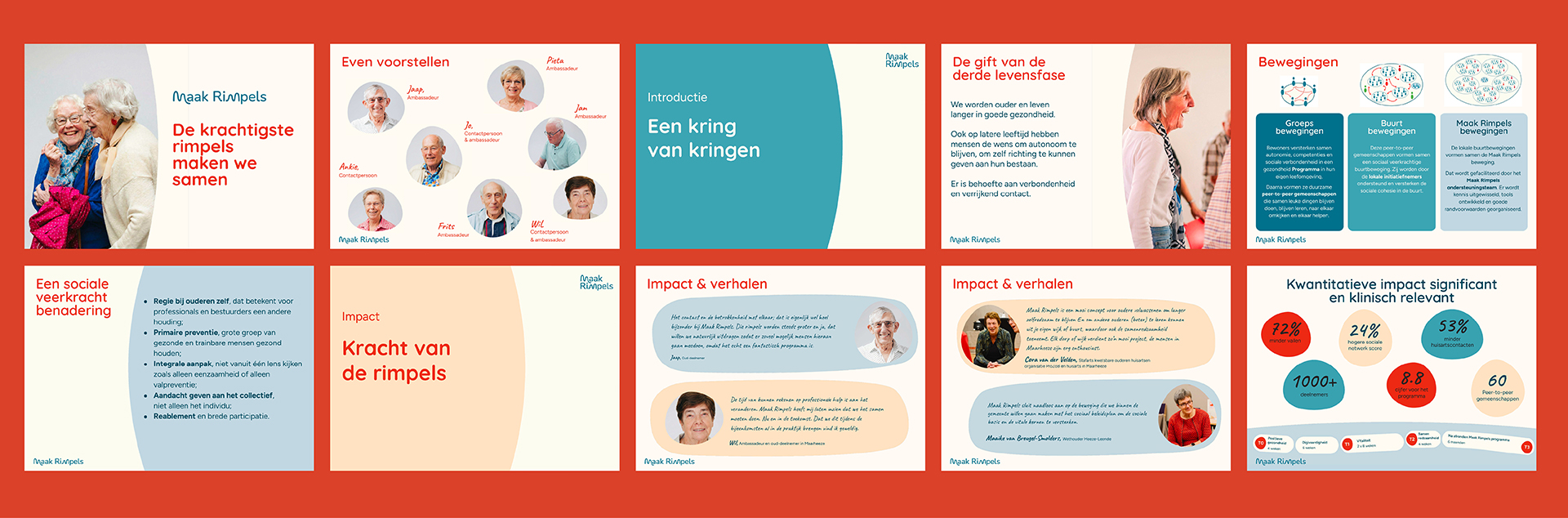
A complete rebranding, including updated language, color, and typography. The new visual system introduces warmth and approachability, helping the initiative feel more accessible and personal. Without changing the name, the project reframes what Maak Rimpels stands for, making it easier for people to recognise themselves in it and take part.